I joined the LastPass team when the product was acquired by LogMeIn. At the time the product had over 8 million active users and a product & engineering staff of about 9 people. Over a decade the product had grown organically, resulting in a powerful but difficult-to-use tool.
At the time this was fine: their user base mostly IT and development users; highly technical users who are good at self-service via documentation.
The Problem
As part of the acquisition, LogMeIn intended to bring the product to the significantly larger consumer market. We had already explored making our own password-management solution, and decided a customer-centric acquisition would help us better position ourselves in the market.
This meant taking a product that was complex, inconsistent, and in an intimidating space (security) and making it both appealing and usable for everyday, family-focused consumers.
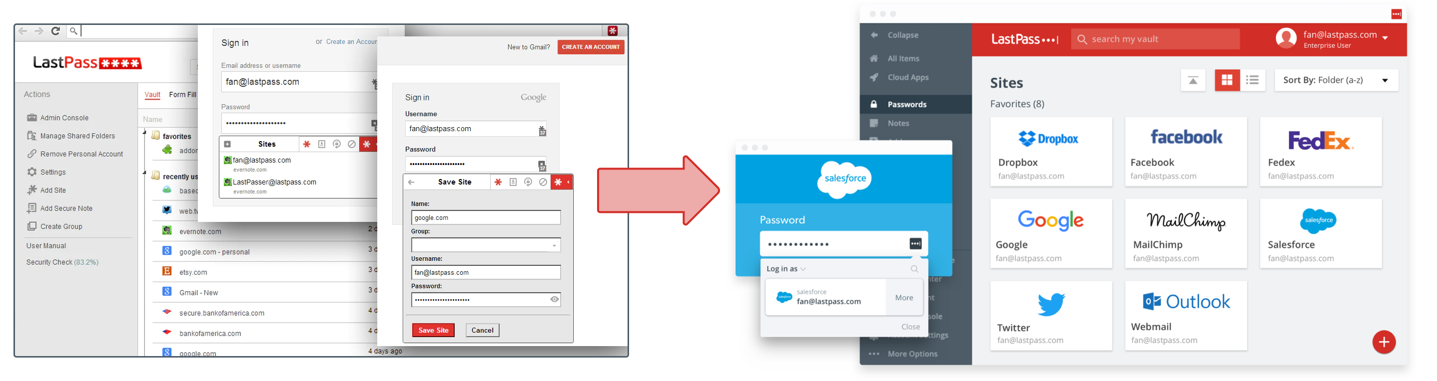
Lastpass before and after
Part 1: Triage
The first step to solving any problem is understanding it. To that end, we kicked off with a series of usability tests and interviews with users in our new target market and the existing IT user base.
Working under our director of design as the most senior product designer on the team, my first responsibility was to work with our user research team to design and execute appropriate tests, and present an initial plan to move forward.
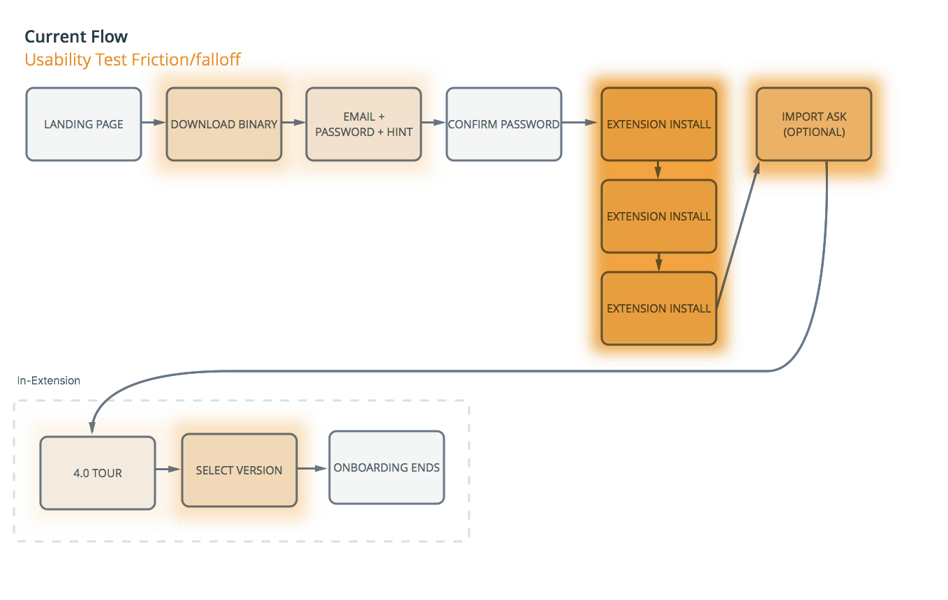
A series of live usability tests and interviews highlighted to a few steps contributing to most drop-offs. The main offenders were the "binary installer" (aka desktop application) install flow, and an initial password scrape from users' browsers. This strategy assumed that the best LastPass experience was one where it worked everywhere right away. This was true for research-oriented IT users, but consumers found it intimidatingly aggressive.
The Plan
Our analytics showed a #1 predictor for user retention: filling the password for their 2nd site. I proposed the new flow and sequencing of work shown to the left, which would address the issues concerning marketing and product in order of severity.
The first two steps would quickly rework our flow to provide a less-comprehensive but simpler install via Chrome Web Store (a trusted source), and a new onboarding experience that would get users secured to their personal comfort level.
From there, a more comprehensive rework of signup, desktop installation, and features tours would help set our customers up for success.
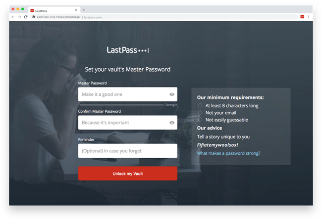
The new signup
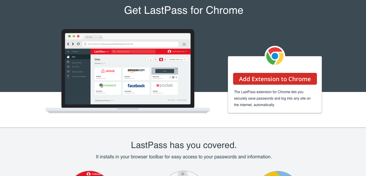
Sometimes the best design is no design. Our new onboarding started in the official Chrome Web Store, a way to build trust with our users by leaning on the reputation of Google and Chrome.
Once in the product, our signup was overhauled based on a few key principles we identified for these new consumer personas: trust, simplicity, and safety. LastPass should be your "trusted, tech-savvy friend", who always knows what to do but isn't a jerk about it.This could be tough with end-to-end encryption model we used, since there are risks of irretrievable loss that aren't typical of modern web-based software.
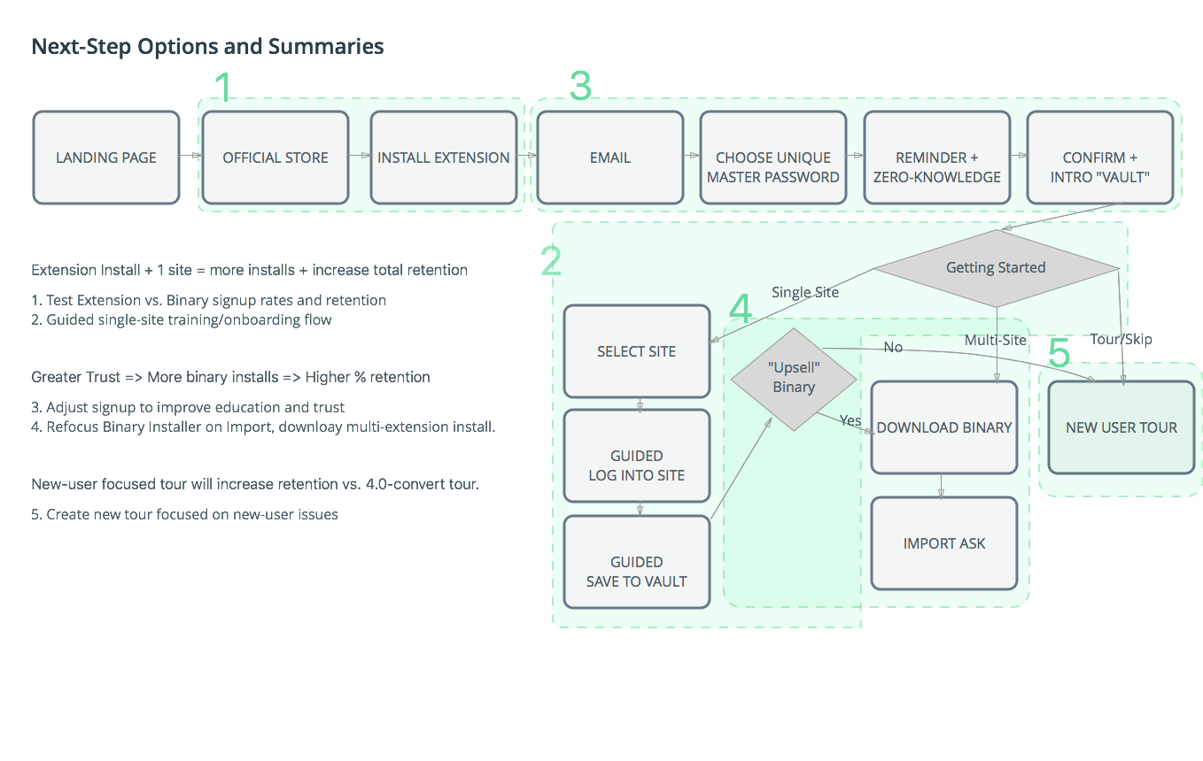
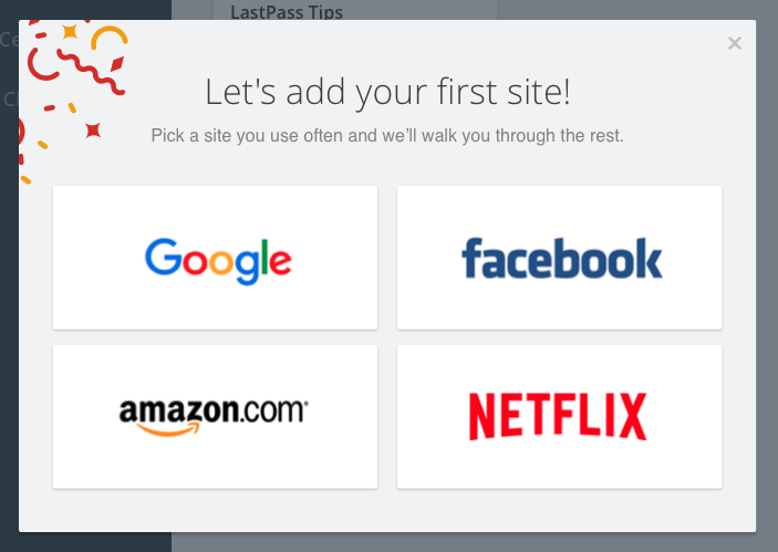
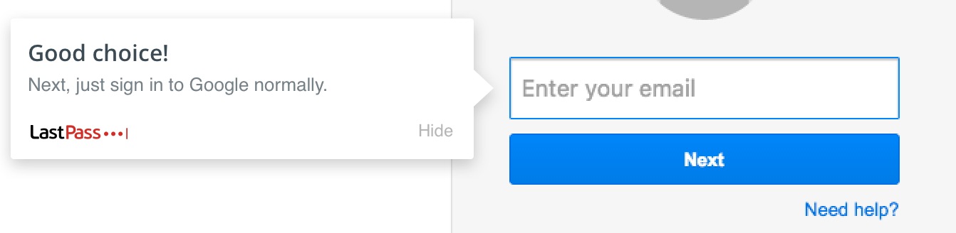
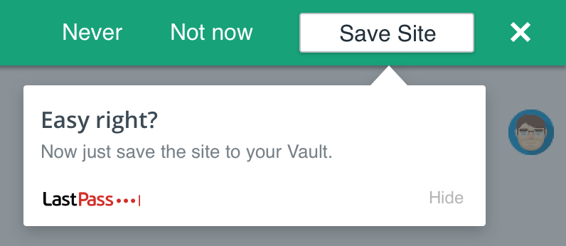
Just fill two sites
Our new analytics driven strategy was to get new users to fill the password for their 2nd site. Interviews and tests suggested the main barrier to success stemmed from onboarding not matching daily use.
To that end, we began design and testing of a new onboarding system that would help users save and use passwords in the context of every day browsing. This new, interactive system needed to be scoped down to a small number of sites for development purposes, so we focused on four sites that required frequent or multi-device password verification.
This new flow guided the user through entering their email and password as usual, how to interact with our existing save-a-site dialog, and how to trigger a password fill.
Between the new signup this was a very rapid project that included minimal actual changes to core interactions, but still produced a 30%+ increase in new user retention, surpassing one of our main metrics for the entire workflow update in the first few stages.
Unfortunately, conversion to paid plans and deeper feature usage didn't improve at all, which suggested we had a whole new problem.
How are we doing so far?
😊 ~30% increase in new user retention. 🙂New browser-extension and mobile-focused strategy. 🤔 New Problem: Inconsistent web experience that assumed desktop install.
Organizing The LastPass Universe
LastPass is a product that was organically built by a small, nimble team of highly skilled software developers over 5-10 years. This strategy produced a product with very deep, complex featuresets but no overall design language. Various pages used different interaction patterns and visual styles based on when or how they were built.
This wasn't actually a huge problem for the existing userbase of more technical IT users, but for everyday users it was a barrier to feature use–and thus paid conversion.
At the same time, our team was rapidly scaling. From an original team of ~6 developers and 1 designer, we were approaching 100 engineers on two continents, and a design team of 5 that would double within a year.
We needed a design system, and a way to get it into production.
Growing a design system in an enterprise-scale organization
The initial version of our design system came out of the daily needs of the design team. Working with my counterpart at the remote LastPass office, we created and organized a shared resource—closer to a stickersheet than a proper design system—which evolved into an interactive design library as Sketch added support.
This served our needs as designers very well, but it wasn't translating into the product fast enough. The amount of UI development resources needed to overhaul so many pages was slowing down development, and meant many feature areas kept their existing, inconsistent UI patterns.
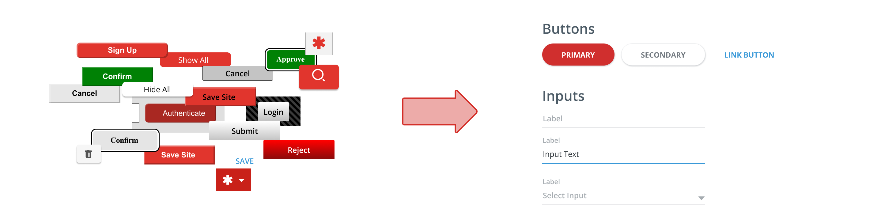
The seed of our real design system came out of an experiment. Myself and a UI developer wanted to see how hard it would actually be to build a component library in Angular, the UI framework being used for most new and updated features. Our plan was to tackle it for the next company hackathon, but a few nights and weekends later we had already finished the first version of "Tether"—the cheekily-named design system we hoped would tie our product back together.
Designing a Design System
As it began to see more use on and off the design team, the logistics of maintaining a design system became the bigger challenge. The first few months were focused on building grassroots adoption and solving daily-use problems. After all, if we were going to convince 100 developers to change their habits, it needed to be easier to adopt the design system than not change.
Many heated lunch discussions and whiteboard sessions later, we had a wonderful new problem: too many people adding too many things. The inconsistency was coming back, as duplicate components introduced different UI styles or interaction patterns.
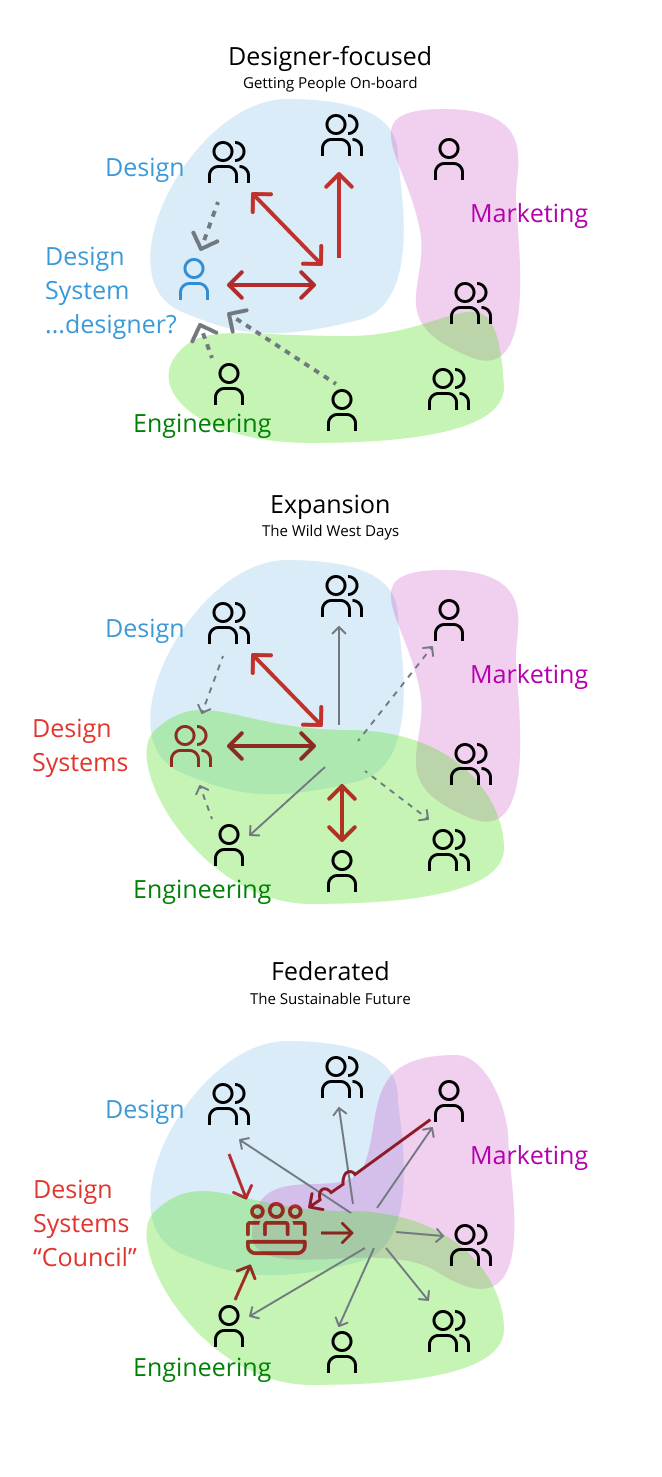
After a few more months of experimentation, we settled on what's often called a "Federated" design system. In this model, there was a cross-disciplinary group that advised and guided new additions to the (now official) LastPass design system. If a new submission overlapped with an existing component, we could instead redirect efforts towards extending and refining what we already used.
This also helped improve some aspects of our project management. Since new designs were typically completed and tested before development started in earnest, it became possible to lead by UI development, with most components ready and available before they were needed.
Design system as utility
Over the next two years, our humble side project grew to support the entire product. As it expanded to cover mobile, marketing needs, and even brand and illustration guidelines we started to see some larger effects.
The biggest and best benefit in my opinion was harmonizing design across other teams. As our design system, illustration guidelines, and other elements became standardized in-product, they became useful assets for marketing, brand, customer support, and other teams that dealt with end users. As more resources were pooled into the centralized design system, all our teams could spend less time designing buttons, and more time focusing on what the users needed.
I hope you found this case study interesting!
Want to see more examples of my work? Check out my UI Gallery.
